
The Nudge
The number, or the story behind it?
In our session, we looked at how the way we measure safety can quietly become the reality we're managing. This is a short follow-up. It takes about five minutes. One idea, one small step to try this week.
- 1Two definitions1 min
- 2Different evidence1 min
- 3Why we do this as humans1 min
- 4A necessary calibration1 min
- 5When a measure reshapes behaviour1 min
- 6Curiosity Challenge1 min
Nothing here is scored. Nothing is saved or sent anywhere. This stays between you and this page.
Two examples of safety definitions.
Tap each one to see what it's really saying. We'll come back to both all the way through this module.
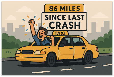

Keep both of these definitions in mind. Everything else in this module runs off the gap between them.
Three places to look.
Different definitions of safety lead us to look for different evidence. Tap each one to see what it usually includes.
Back to our two examples. If safety is the absence of accidents, like the taxi driver's sign, you'll watch the safety data, incidents, near misses, audit findings. If safety is an emergent property of a complex system, like the controller's screen, you'll need to watch the operational and resource data too, equipment, staffing, workload, the conditions the system is actually operating under.
The comfort of certainty.
Humans are drawn to measurement because it gives us a sense of certainty. A number feels solid and manageable, even when the reality behind it isn't.
Once we have a number, we start looking for patterns in it, patterns that help us feel more in control of the risks we're facing. That instinct isn't wrong. It comes from a very real, very human drive to reduce harm.
But it also means we can end up finding patterns that aren't really there, and missing the ones that are, because we're seeking reassurance as much as we're seeking truth.
Is there something at your site that genuinely matters, that you've never been able to put a number on? And is there a number you already track that, honestly, doesn't tell you very much?
A balance, not a fix.
That's still true even for a "better" measure. Watch operational or resource data closely enough, and it can be gamed and reshaped too, the same as any incident count.
Shifting attention there doesn't remove the need for safety data either. Regulators and commercial markets will still want incident numbers, and this wider evidence rarely gives you one tidy figure the way an incident count does.
The goal isn't to replace one measure with another and call it solved. It's staying alert to the fact that whatever you choose to watch closely will start to change, that's the calibration worth holding onto.
Two ways it can play out.
Barnesian Performativity doesn't just quietly shape behaviour, sometimes it's visible enough to have a name of its own. Tap each one.
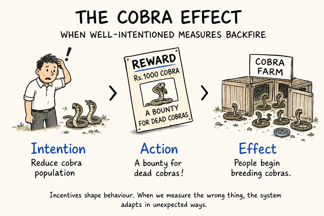
The same logic shows up in safety systems: reward the appearance of zero incidents, and effort can quietly shift toward managing how events get classified, rather than the risk itself.
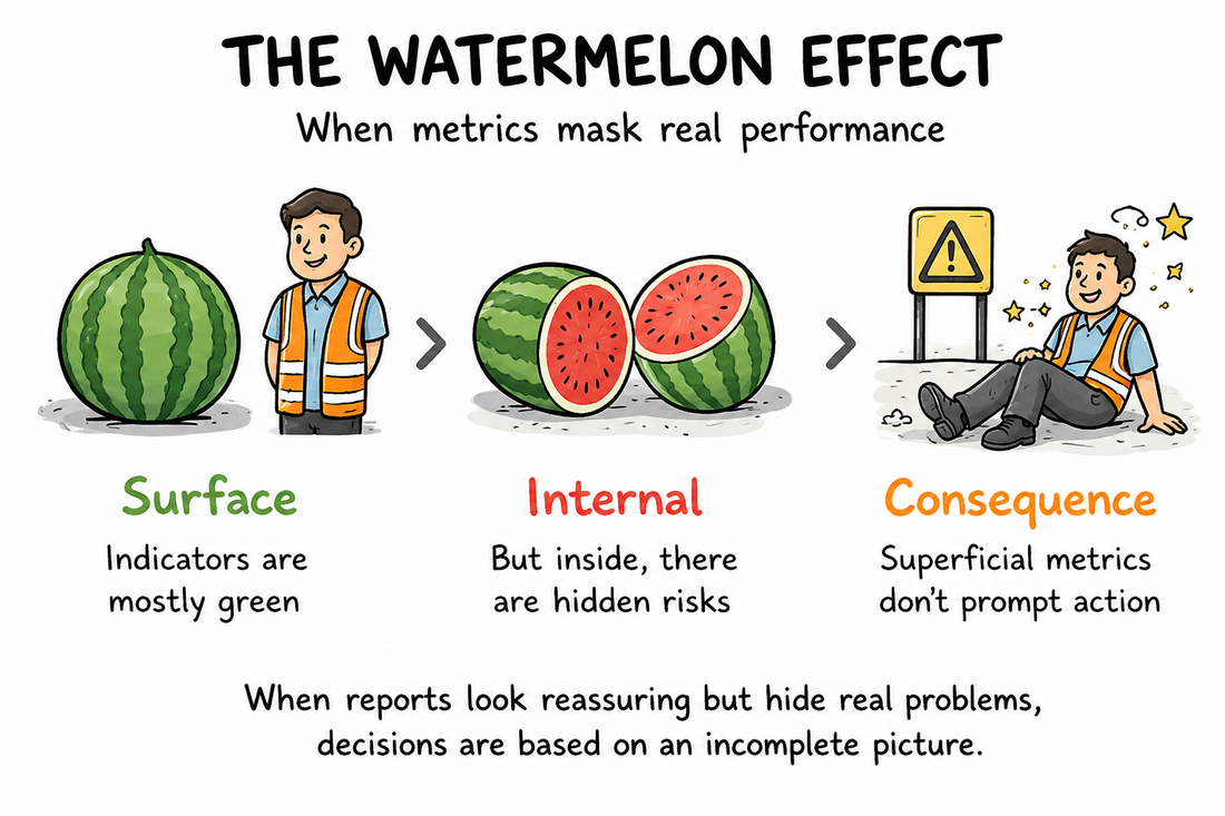
It isn't manipulation. It's simply what a lagging, surface-level metric can and can't tell you. Reports can look reassuring while real conditions are quietly getting worse underneath.
One thing to carry into this week.
Nothing to build or commit to yet. Just something to notice.
Pick one recurring meeting where safety or performance data gets reviewed, a governance forum, an ops review, a safety huddle.
During that meeting, notice:
- how much time goes to safety data versus operational and resource data
- which data points create visible tension, or visible relief, in the room
- whether anyone deliberately asks about the strain nobody's logging
Then finish this sentence, honestly:
“In my performance reviews, our measurement approach truly rewards…”
The email opens in your own mail app with a blank To field — nothing leaves this page otherwise.